WEB DEVELOPERBANGLADESH

Hi, I’m

Subhan
Ansari.

AI Powered Software Development
and Digital Solutions.

  • WordPress
  • WooCommerce
  • Custom websites
Subhan Ansari, Web Developer
ABOUT ME Back to Home
Subhan Ansari, Web Developer
6Years of
experience

WEB DEVELOPER · BANGLADESH

I’m Subhan
Ansari.

I build WordPress websites, WooCommerce stores and custom web experiences for real businesses.

My approach is simple: understand what you need, build around that purpose, and refine the details across desktop and mobile.

Let’s build something useful

Recent Work

Explore a project

Skills & Expertise

WordPress & Elementor

Editable websites & page design

WooCommerce

Stores, checkout & customer accounts

Custom websites

Purpose-built pages & functionality

Responsive development

Layouts that work across screen sizes

On YouTube

View channel

Client Reviews

I worked on the website with Sobhan Ansari. He provides really great service.
Md Masud Rana
Definitely, Subhan Vai You are a Great Minded person and Good mentor
Salina Bd Food Vlog
Highly recommend 'Subhan Ansari' to all they're beginners and starters at Freelance.
Farhan Tanvir
Really Very Helpful Person and Have Good Hearted Personality.
Anarul Paik
Best Teacher freelancer
Jish An
আর ভাইয়ের ব্যবহার এবং বোঝানোর কৌশল সত্যিই অসাধারণ।
Md Sajjad Sheikh
Subhan Ansari is very helpful person. May Allah bless him
Monni Akter
অত্যন্ত পরোপকারী এবং নিরহংকারী মানুষ আপনি আমার চোখে। দোয়া ও শুভকামনা অবিরাম।
Md. Nure Alam
আপনার সাথে এড হয়ে অনেক কিছু শিখতে পারলাম, আশা করি এভাবে আমাদের সাহায্য করে যাবেন
Minhajul Islam Hridoy
Subhan Ansari Is a good person.
Md. Alamin Biswas

Have a website project in mind?

Let’s talk about what you need.

Let’s Talk
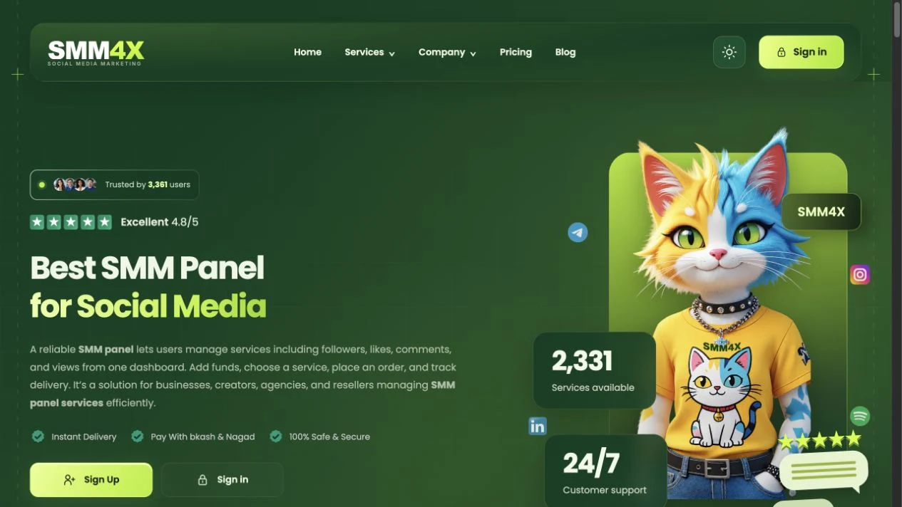
smm4x.comSMM4X desktop website screenshot
SMM4X mobile website screenshot

SMM4X — Website Design & Development

Designed and developed by Subhan Ansari — from the visual direction to responsive pages, interactive features and technical SEO.

Website: smm4x.com
My role: Website design, frontend development, responsive implementation, content refinement and technical SEO
Technology: Next.js · React · HTML · CSS · JavaScript

A website I built for SMM4X

I designed and developed SMM4X’s public-facing website to help visitors discover social media services, compare their options and move confidently into the customer account area. My work brought together the visual design, page layouts, navigation, pricing interactions and blog experience.

The result is a connected marketing website with a recognizable green-and-lime identity. Visitors can explore services and practical guides, then follow the sign-in or sign-up links to the separate ordering dashboard.

What I was responsible for

  • Visual design: Deep green surfaces, subtle lime gradients, readable typography and clear action buttons.
  • Frontend development: Responsive page layouts, reusable navigation and footer patterns, and consistent content spacing.
  • Interactive features: Platform-based pricing filters, expandable link groups and mobile navigation.
  • Content and technical SEO: Article layouts, clearer page copy, canonical and sitemap checks, and indexing follow-up.

The technology behind the website

TechnologyHow it supports the website
Next.js & ReactThe public website’s page and component structure, shared interface elements and client-side interactions.
HTMLSemantic headings, navigation, article content, links and page structure.
CSSThe green-and-lime visual system, responsive grids, spacing, image presentation and interactive states.
JavaScriptPricing filters, navigation controls and other interface behaviour.
Technical SEOCanonical URLs, sitemap consistency, crawl checks and public-page verification.

How I built the experience

I started with the visitor journey: discover a service, understand the available options and continue to an account. I organised the pages around that flow, then developed a shared visual language so the homepage, pricing pages, guides and footer felt like parts of the same website.

I refined the layout across desktop and mobile, checking image sizes, spacing, navigation and content width. Changes were introduced in focused steps while preserving existing public URLs and the connection to the account dashboard.

Service discovery and interactive pricing

I developed the pricing presentation around platform filters with clear selected states. This helps visitors focus on the relevant service groups instead of scanning every option at once. I checked that switching platforms displayed the matching results and that the controls remained usable on smaller screens.

SMM4X pricing page showing the YouTube platform filter selected
Live website: platform-based pricing controls and the selected YouTube view.

A clearer blog and content system

I simplified the blog listing into a focused grid with topic-specific thumbnails, titles, publication details and a clear reading action. The consistent image treatment gives each article its own subject while keeping the collection visually connected.

SMM4X blog listing with topic-specific article thumbnails and reading buttons
Live website: a reusable article-card layout with clear topics and reading actions.

For individual articles, I created a structured reading experience with breadcrumbs, author information, a table of contents and a large cover image. I aligned the sidebar and article width with the wider website layout and applied the shared treatment across 12 articles.

SMM4X article layout with its cover image, author panel and table of contents
Live website: the reading layout used for the SMM panel guide.

The website contains service pages, country guides, free tools and educational resources. I organised the footer into clear link groups, with expandable lists that reveal additional links when needed. This keeps the initial view manageable without removing useful destinations.

The live footer also credits my work with “Developed by Subhan Ansari”, linked to this portfolio. You can see the credit in the screenshot below or check the live website.

SMM4X live footer including the Developed by Subhan Ansari credit and resource links
Live website: organised resources and the developer credit linking to my portfolio.

Technical checks and delivery

Alongside the interface work, I improved 25 priority content pages and reviewed crawl access, indexing permission, canonical URLs, heading structure and public rendering. I reconciled 270 unique public sitemap URLs against indexing reports and kept accepted submission requests separate from confirmed indexing.

Desktop and mobile checks covered image loading, pricing-filter results, expandable links and horizontal overflow. These checks helped confirm that the delivered interface worked as well as it looked.

Owner feedback and the finished result

The SMM4X owner was very happy with the completed website. The final experience brings the brand, service discovery and educational content together in a consistent, responsive design.

For me, this project demonstrates how I combine visual design and frontend development with practical functionality: a website people can navigate, content they can read comfortably and a structure that can support future additions.

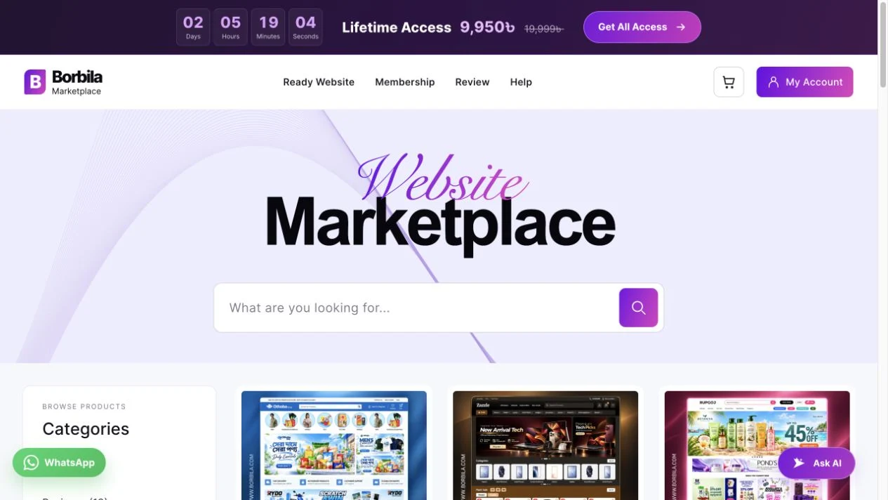
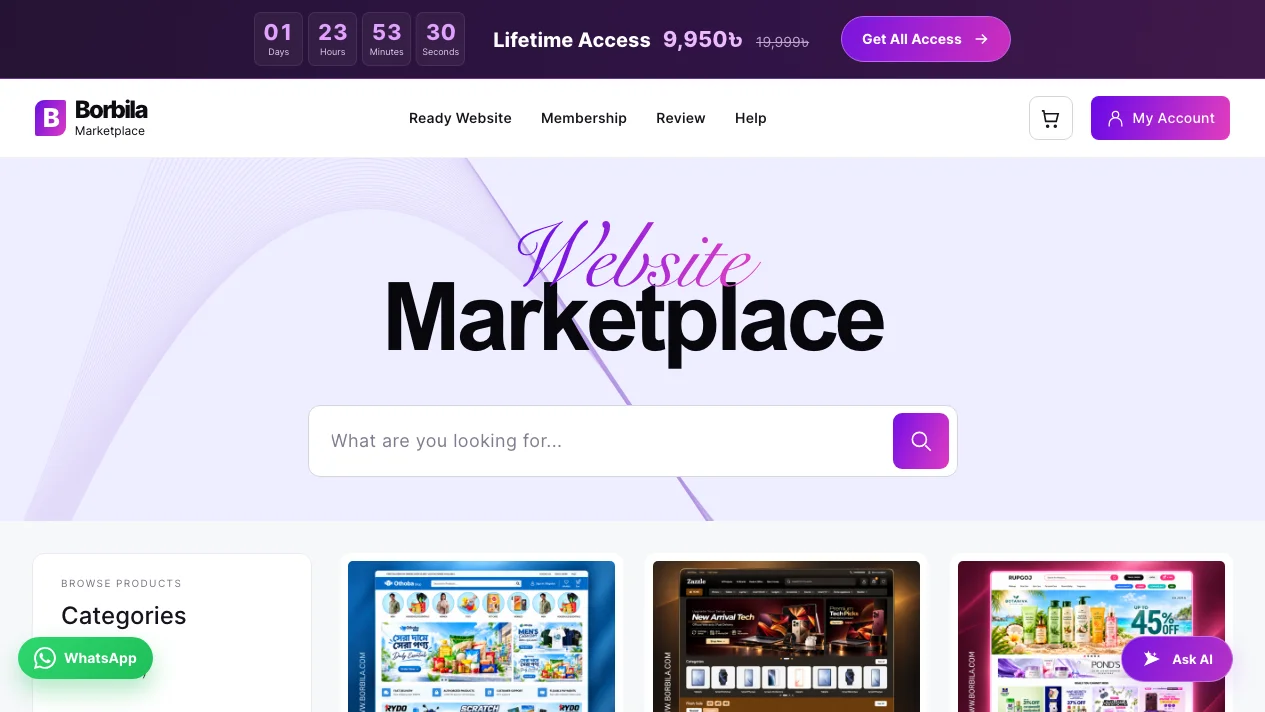
borbila.comBorbila desktop website screenshot
Borbila mobile website screenshot

Borbila — Website Design & Development

Designed and developed by Subhan Ansari — a WordPress marketplace connecting ready websites, memberships and customer downloads.

Website: borbila.com
My role: Website design, WordPress development, custom functionality and customer journey improvements
Technologies: WordPress · WooCommerce · PHP · HTML · CSS · JavaScript

A marketplace I designed and developed

I designed and developed Borbila’s marketplace experience for ready-made WordPress websites and plugins. My work connects the storefront customers see with the functionality they need after buying: product discovery, individual purchases, lifetime membership and access to their downloads.

This project involved more than styling a catalogue. I worked on the shopping interface and custom WordPress functionality together, so browsing, choosing a product and returning to an existing purchase could feel like one connected experience.

What I was responsible for

  • Visual design: A consistent purple-and-magenta identity, clear product cards, readable page layouts and responsive navigation.
  • Storefront development: The catalogue, product pages, membership presentation and importer landing page.
  • Custom functionality: Title-based product search, category navigation, pagination, mobile cart counts and membership offer interactions.
  • Customer access: Purchase-aware download buttons, repeat-purchase handling and the connection between membership downloads and licensing.

The technology behind the website

TechnologyHow I used it
WordPressThe content and plugin foundation for the marketplace and its supporting pages.
WooCommerceProducts, cart, checkout, orders, customer accounts and downloadable-product permissions.
PHPCustom page rendering, WooCommerce hooks, purchase checks and membership download handling.
HTML & CSSPage structure, product grids, responsive layouts and the purple-and-magenta visual system.
JavaScriptCategory controls, pagination interactions, cart updates and the membership offer’s copy-code action.
Hello Elementor child themeThe theme foundation extended with custom marketplace layouts and styles.

How I built the experience

I organised the website around a practical customer journey: find a ready website, inspect its design, choose a purchase option and access it from an account. The catalogue became the homepage, giving visitors direct access to the products instead of making them pass through another introductory page.

I kept the full-width section backgrounds while constraining the content to a consistent reading width. The same spacing, card styling and navigation patterns carry through the catalogue, product details and supporting pages.

Product discovery that stays focused

I developed a catalogue with a wider category sidebar and three product cards per row on desktop. Search is focused on product titles, and pagination divides the collection into manageable pages. Each card combines a real design preview, product name, price and clear actions.

On smaller screens, the layout changes to a compact grid with category controls suited to touch. The mobile navigation includes Cart with an item count, helping customers keep track of their selection.
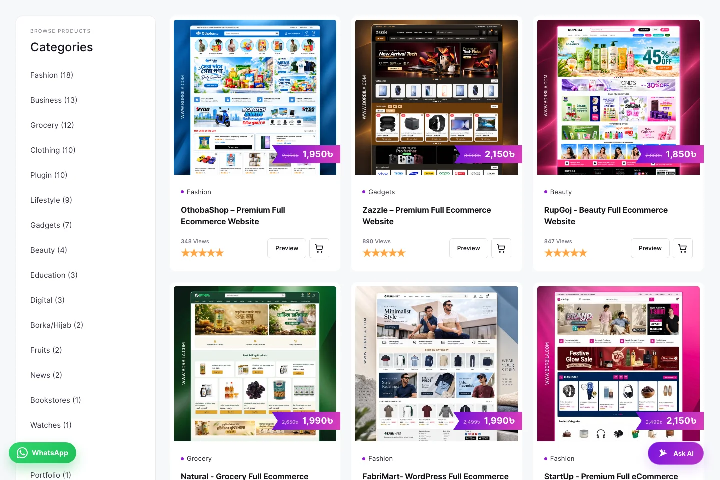
Borbila product catalogue with category navigation and ready website cards
Live website: category-led browsing and a consistent three-column product grid.

Product pages that explain what customers receive

I brought the preview, price, product information and purchase actions into a clear product-page layout. Live-demo and tutorial links help visitors inspect a design and understand the next steps before making a decision.

The product information also explains the WordPress and Elementor context of the ready websites. This makes the format easier to understand for customers who want an editable website rather than a static visual design.
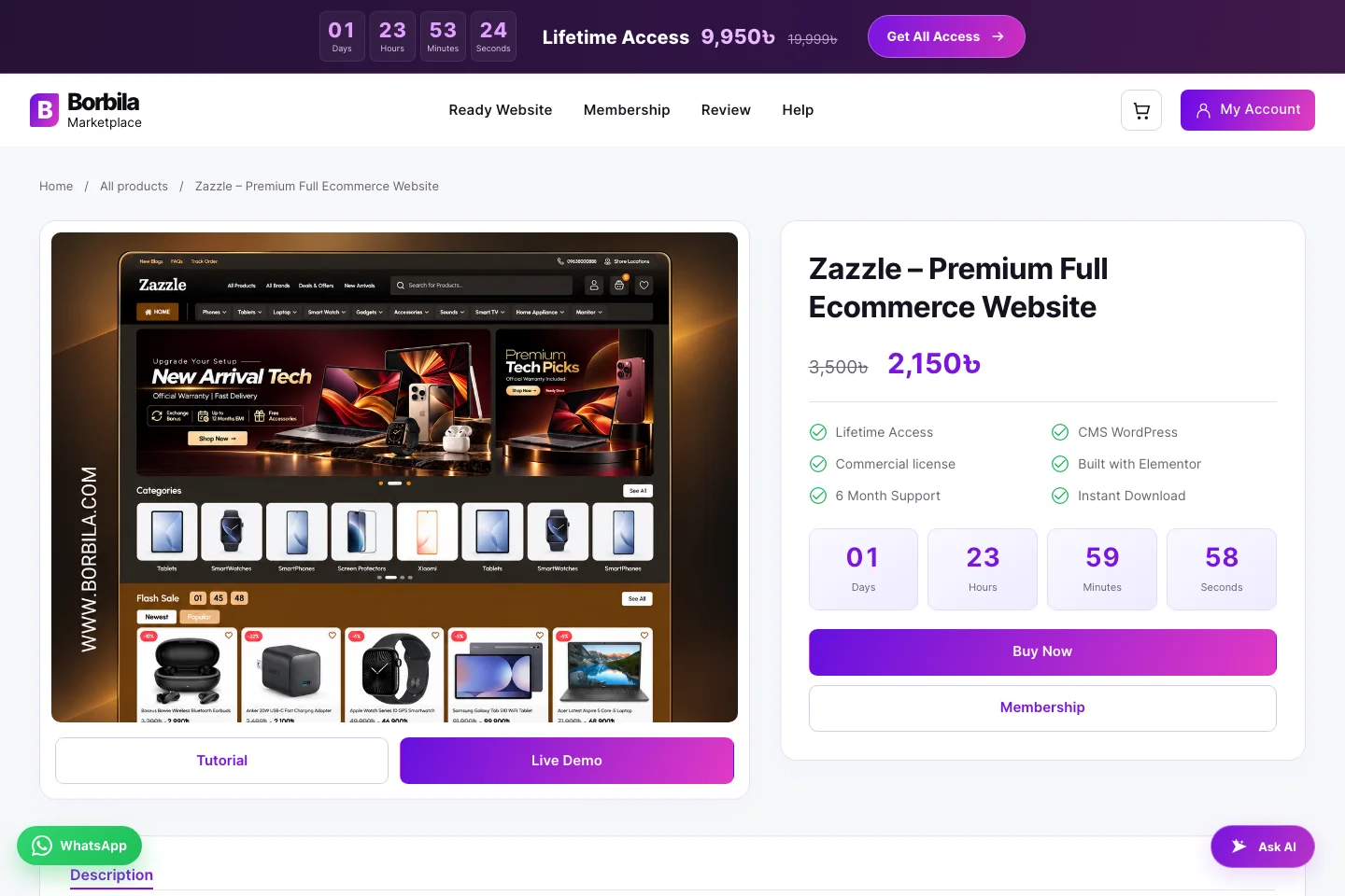
Borbila Zazzle product page showing its website preview, price and purchase information
Live website: the Zazzle product page brings preview and purchase information together.

A clear route to lifetime membership

I developed the membership presentation around a direct comparison between an individual purchase and lifetime access. Visitors can see the difference in coverage before continuing to the membership purchase.

I also implemented a timed membership offer with a copyable coupon code. Its controls provide copy feedback and a clear way to close the offer or visit the membership page.
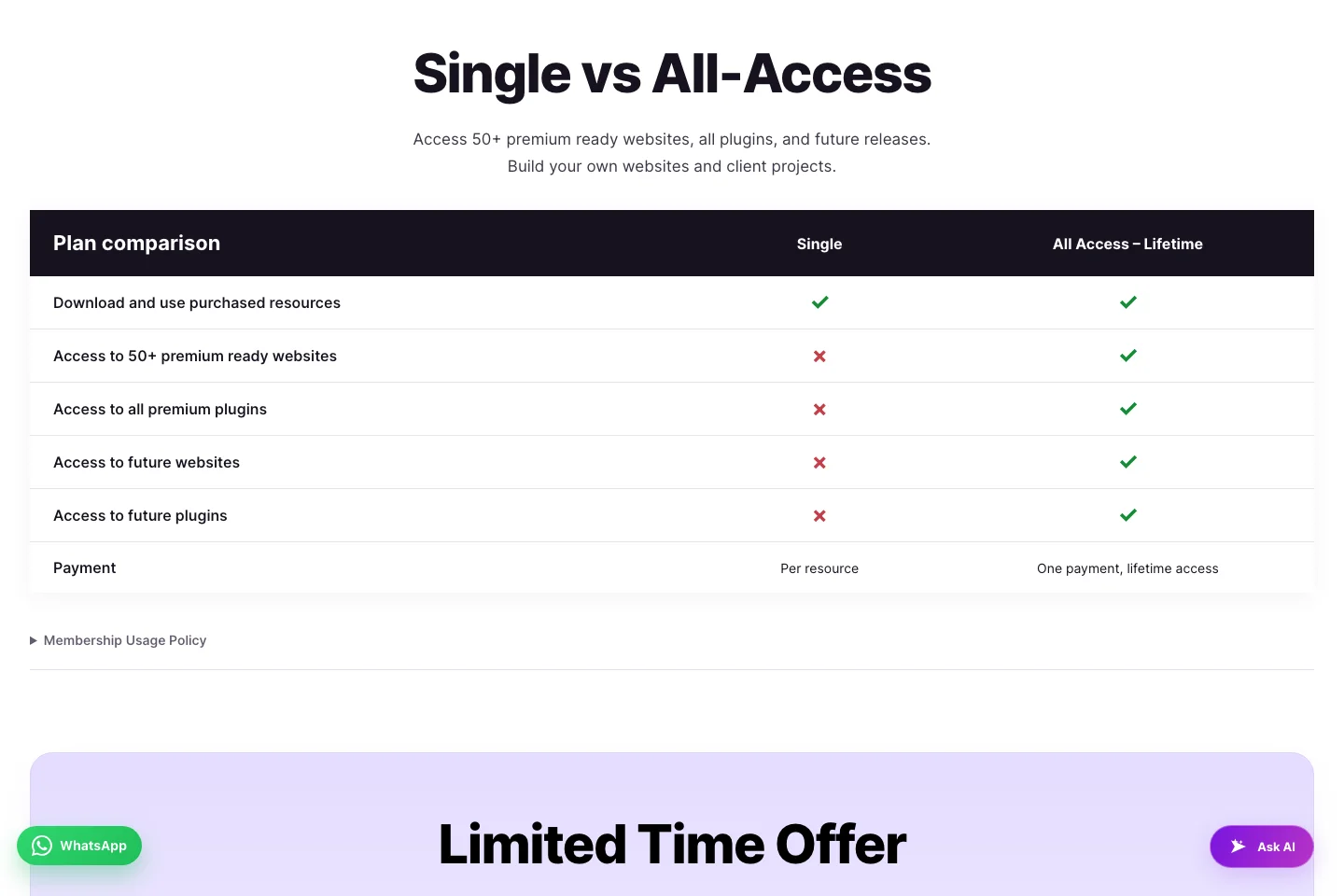
Borbila comparison of single purchases and lifetime membership
Live website: a side-by-side comparison explains the membership option.

Connecting purchases, downloads and licences

I worked on the custom logic behind the post-purchase experience. For ordinary buyers, an available download replaces the purchase action when their account already has valid download permission. An existing purchase with missing access directs the customer to their account instead of silently granting a new entitlement.

For members, the direct-download flow connects an eligible product request with its order, download permission and licence. The flow reuses existing access instead of creating a fresh purchase and licence for every download request. Guest and non-owning visitors retain the normal purchase route.

These rules keep the interface tied to account permissions rather than treating a visible Download button as authorization on its own.

Helping customers move from download to setup

I built the importer landing-page presentation to explain the next step after purchase. It introduces the WordPress import workflow and gives customers direct access to the plugin and tutorial.
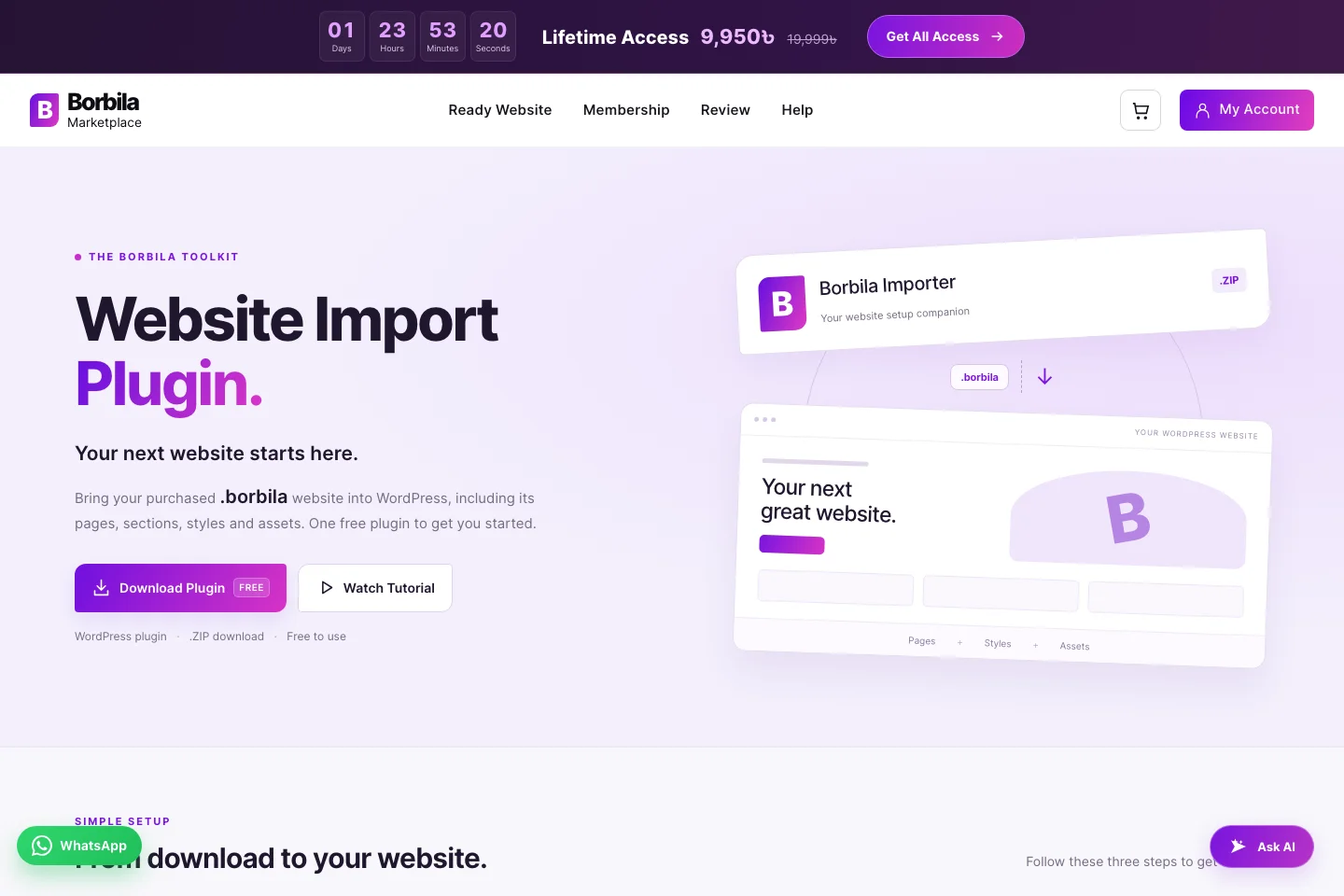
Borbila website import plugin landing page with download and tutorial actions
Live website: the importer page connects the purchased website with its setup workflow.

The finished experience

Borbila demonstrates my work across both interface design and custom WordPress development. A consistent storefront introduces the products, while WooCommerce and custom functionality connect purchases, membership and account access behind the scenes.

The result is a live marketplace built around the complete journey: discover a website, inspect it, purchase access and return to download it. The screenshots above show the public experience; customer account information and licence details remain private.

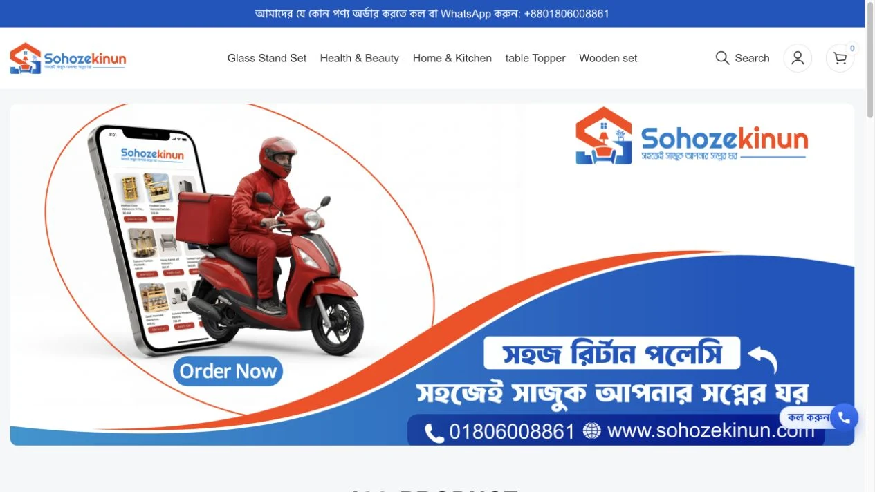
sohozekinun.comSohoze Kinun desktop website screenshot
Sohoze Kinun mobile website screenshot

Sohoze Kinun — Website Design & Development

Website development by Subhan Ansari — a Bengali ecommerce storefront built around real products, clear categories and accessible ordering.

Website: sohozekinun.com
My role: WordPress storefront development, theme customization and responsive shopping layouts
Technologies: WordPress · WooCommerce · Elementor · WoodMart · CSS · JavaScript

An online store I developed for everyday shopping

I developed and customized the Sohoze Kinun storefront for home, kitchen and everyday products. The goal was straightforward: help customers understand what is available, inspect a product and find the next step without working through a complicated interface.

The store combines Bengali product information with familiar ecommerce controls. Product photography leads the experience, while categories, prices and ordering actions provide the practical details customers need.

What I worked on

  • Storefront structure: A homepage that introduces the shop and leads directly into the product collection and new arrivals.
  • Theme customization: A consistent storefront built on the WoodMart theme and its WordPress child-theme structure.
  • Product discovery: Category navigation, search access and product cards that keep names, prices and actions together.
  • Responsive presentation: Desktop and mobile layouts for browsing products and accessing store controls.

The technology behind the store

TechnologyIts role in the website
WordPressThe foundation for managing website content, pages and extensions.
WooCommerceProduct data, pricing, categories, cart, checkout and customer accounts.
ElementorPage composition and editable storefront content.
WoodMart & child themeThe ecommerce interface foundation, extended with site-specific styling and scripts.
CSSLayout spacing, typography, visual consistency and responsive adjustments.
JavaScriptInteractive storefront controls and the site’s cart and ordering interface.

How I assembled the shopping experience

I built the storefront around the existing WordPress ecommerce stack, combining editable page content with WooCommerce’s product structure. This lets the business maintain its catalogue without rebuilding the surrounding page for every new item.

The page hierarchy starts with the store identity and category navigation. The homepage then introduces products through image-led cards, followed by a separate new-arrivals section. Blue and orange branding connects the promotional artwork with the shop’s identity, while the product area uses a restrained white background.

A catalogue built around the products

The catalogue puts the photograph first. Each card keeps the product name, category, current price and Bengali ordering action within the same visual group. Sale products also show the original price so customers can read the offer in context.

I used a repeatable card layout to make different products feel part of the same store. A load-more control extends the collection without requiring every product to occupy the initial page view.

Sohoze Kinun catalogue with product photographs, Bengali names, prices and ordering controls
Live storefront: product imagery, prices and Bengali ordering actions are grouped into consistent cards.

Giving a varied collection a clear structure

Home and kitchen products cover several different needs. Category pages give shoppers a more focused view than the complete homepage collection, while familiar navigation keeps the route back to the rest of the shop visible.

The store uses WooCommerce categories rather than disconnected product lists. This connects navigation, product cards and category pages to the same catalogue information.

Sohoze Kinun Home and Kitchen category page
Live category page: a focused collection for customers browsing home and kitchen products.

From a product preview to an ordering decision

The product page gives an item more room than a catalogue card. Its imagery, title, pricing and product details help customers inspect what they are buying before continuing to an order.

Bengali copy and visible contact options reflect the store’s audience. Cart and account controls remain part of the wider WooCommerce experience, while the storefront also provides direct ordering controls close to the products.

Sohoze Kinun wooden stand product page with images and product information
Live product page: a closer look at the item, its price and the information supporting an order.

Adapting the store for smaller screens

The mobile presentation brings navigation and product browsing into a compact layout. Images scale with the available width, and store controls remain reachable without relying on a desktop-sized menu. The desktop and mobile banner above shows the same storefront in both formats.

My focus was on keeping the essential shopping information together: what the product is, what it costs and where the customer can continue.

The finished experience

Sohoze Kinun brings together an editable WordPress storefront and WooCommerce’s catalogue and account structure. The project demonstrates my approach to ecommerce development: customize a proven foundation, arrange the content around the customer journey and keep the store understandable across screen sizes.

From the homepage catalogue to individual product pages, the same product data and visual conventions connect the shopping journey.

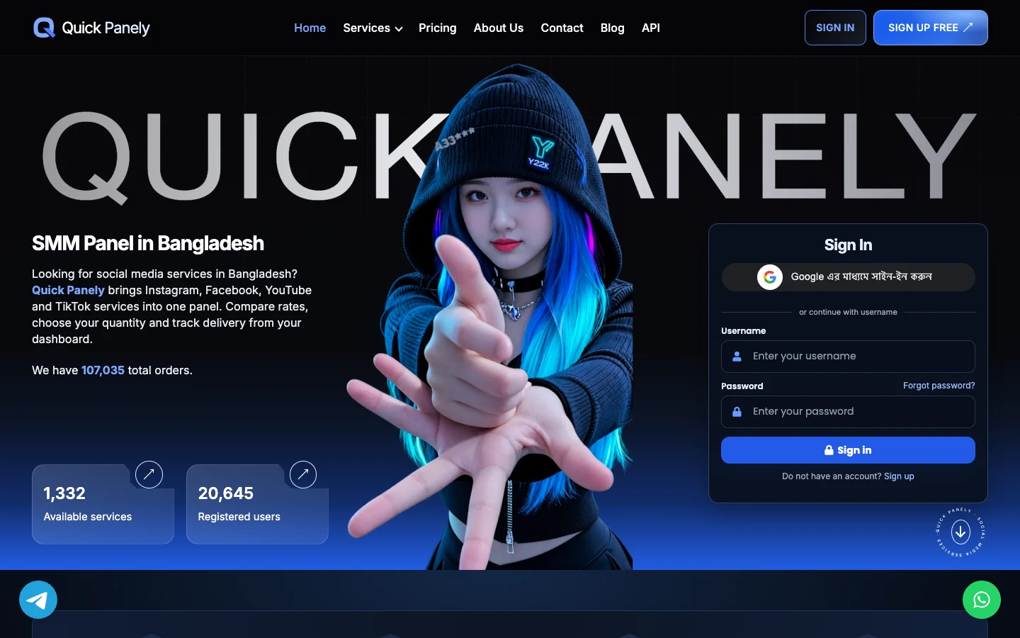
quickpanely.comQuickPanely desktop website screenshot
QuickPanely mobile website screenshot

QuickPanely — Website Design & Development

I redesigned QuickPanely’s public website for two people arriving at the same address: a returning customer who wants to sign in, and someone who needs to understand the services before opening an account.

My role · Frontend design and development
Technologies · HTML, CSS and JavaScript on the existing panel platform

One homepage, two ways in

On desktop I placed the introduction on the left and the sign-in form on the right. A blue-haired character sits between them, in front of the oversized Quick Panely wordmark. I kept the form on a solid navy surface so the illustration and blue glow stay clear of the input labels. On mobile the illustration, introduction and form stack in that order, with sign-up still accessible from the top bar.

Browse by platform

A visitor looking for YouTube services has a more specific question than “What does the panel sell?” I used named platform tabs to narrow that first choice. The selected tab turns blue and the panel below pairs a short description with a link to the relevant services. The full catalogue remains within reach for visitors comparing options across platforms.

QuickPanely’s platform selector with Facebook selected and its service panel visible
Platform browsing on desktop, with Facebook selected.

Show the first order in four steps

I split the ordering explanation into four numbered cards. Each card answers one practical question: where to register, where to add funds, what to enter when choosing a service, and where to look up an order afterward. The cards rise slightly from left to right, making their sequence visible even before the visitor reads the labels.

Four QuickPanely cards for signing up, adding funds, selecting a service and tracking results
The first-order walkthrough, from account creation to tracking an order by ID.

Put a useful question on each guide

For tasks that need more explanation, I designed a row of illustrated guide cards. Each starts with a question someone might have mid-order, such as which link to paste or how to calculate a price quoted per thousand. The thumbnail identifies the topic, and the short description tells the reader what the article will help them do.

Four illustrated QuickPanely guides covering service selection, order links, pricing and tracking
The guide carousel groups service selection, link formats, pricing and order status in one place.